
The art of the album cover is ground we cover here often enough, from the jazz deco creations of album art inventor Alex Steinweiss to the bawdy burlesques of underground comix legend R. Crumb. We could add to these American references the iconic covers of European graphic artists like Peter Saville of Joy Divisions’ Unknown Pleasures and Storm Thorgerson of Pink Floyd’s Dark Side of the Moon. These names represent just a small sampling of the many renowned designers who have given popular music its distinctive look over the decades, and without whom the experience of record shopping—perhaps itself a bygone art—would be a dreary one. Though these creative personalities work in a primarily commercial vein, there’s no reason not to call their products fine art.
But in a great many cases, the images that grace the covers of records we know well come directly from the fine art world—whether appropriated from pieces that hang on museum walls or commissioned from famous artists by the bands. Such, of course, was the case with the much-ballyhooed cover of Lady Gaga’s Artpop, a candy-colored collaboration with pop art darling Jeff Koons, who gets a namecheck in the Gaga single “Applause.” Gaga has put a unique spin on the mélange of pop and pop art, but she hardly pioneered such collaborations.
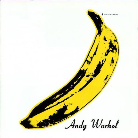
Long before Artpop, there was Warhol, whose promotion of the Velvet Underground included his own design of their 1967 debut album, The Velvet Underground & Nico. The cover originally featured a yellow banana record buyers could peel away, as Flavorwire writes, “to reveal a suggestively pink flesh-toned banana.” The “saucy covers” required “special machinery, extra costs, and the delay of the album release,” but Warhol’s name persuaded MGM the added overhead was worth it. It’s a gamble that hardly paid off for the label, but pop music is infinitely better off for Warhol’s promotion of Lou Reed and company’s dark, droning art rock.
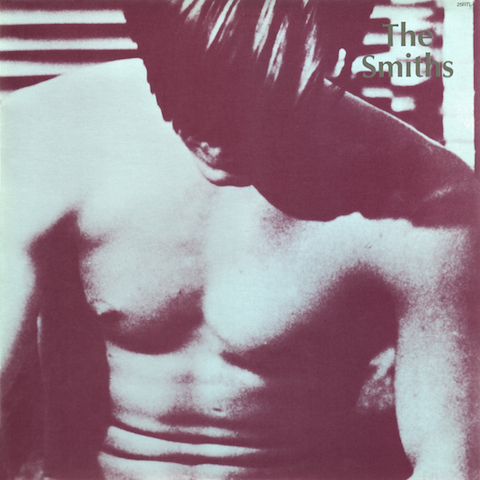
Of the many millions of bands inspired by that first Velvets’ release, The Smiths also looked to Warhol for inspiration when it came to the even more suggestive album cover (above) for their first, self-titled record in 1984. This time, the image comes not from the pop artist himself, but from his protégée Paul Morrissey—a still from his salacious, Warhol-produced film Flesh. Just one of many savvy uses of monochromatic film stills and photographs by the image-conscious Steven Patrick Morrissey and band.
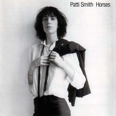
Ten years earlier, another Smith, Patti, posed for the photograph above, a Polaroid taken by her close friend, Robert Mapplethorpe. At the time, the two were roommates and “just kids” struggling jointly in their starving artisthood. In her National Book Award-winning memoir of their time together, Smith describes the “exquisitely androgynous image” as deliberately posed in a “Frank Sinatra style,” writing, “I was full of references.” Mapplethorpe, of course, would go on to infamy as the focus of a conservative congressional campaign against “obscene” art in 1989, which tended to make his name synonymous with sensationalism and scandal and obscured the breadth of his work.

Like the Velvets and Patti Smith, the members of Sonic Youth have had a long and fruitful relationship with the art world, pursuing several art projects of their own and collaborating frequently with famous fine artists. The relationship between their noisy art rock and the visual arts crystalizes in their many iconic album covers. My personal favorite, and perhaps the most recognizable of the bunch, is Raymond Pettibon’s cover for 1990’s Goo, inspired from a photograph of two witnesses to a serial killer case. Pettibon, brother to Black Flag founder and guitarist Greg Ginn, is much better known in the punk rock world than the fine art world, but Sonic Youth has also collaborated with established high art figures like Gerhard Richter, whose painting Kerze (“Candle”) graces the cover of their acclaimed 1988 album Daydream Nation (above).
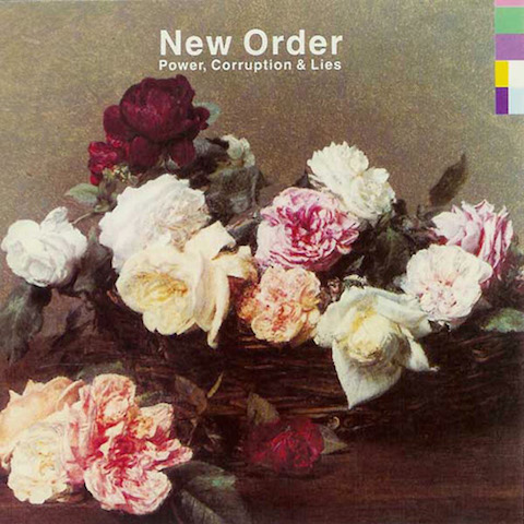
Another example of a band using already existing artwork—this time from a painter long dead—the cover of New Order’s Power, Corruption & Lies comes from the still life A Basket of Roses by 19th century French realist Henri Fantin-Latour. Designer Peter Saville, who, as noted above, created the look of New Order’s previous incarnation, chose the image on a whim. Writes Artnet, “the art director for the post-punk band… had originally planned to use a Renaissance portrait of a dark prince to tie in with the Machiavellian theme of the title, but failed to find anything he liked. While visiting [the National Gallery in London], Saville picked up a postcard of the Fantin-Latour work, and his girlfriend joked that he should use it as the cover.” Saville thought it was “a wonderful idea.” As Saville explains his choice, “Flowers suggested the means by which power, corruption and lies infiltrate our lives. They’re seductive.”

Another art-rock band, the Talking Heads—formed at the Rhode Island School of Design and originally called “The Artistics”—went in a very high art direction for 1983’s new wave masterpiece Speaking in Tongues, their fifth album. Though we’re probably more familiar with frontman David Byrne’s cover art for the album, the band also produced a limited edition LP featuring the work of artist Robert Rauschenberg, which you can see above. Byrne, writes Artnet, approached Rauschenberg “after seeing his work at the Leo Castelli Gallery” and Rauschenberg agreed on the condition that he could “do something different.” He certainly did that. The cover is a “transparent plastic case with artwork and credits printed on three 12 inch circular transparent collages, one per primary color. Only by rotating the LP and the separate plastic discs could one see—and then only intermittently—the three-color images included in the collage.” The artist won a Grammy for the design.
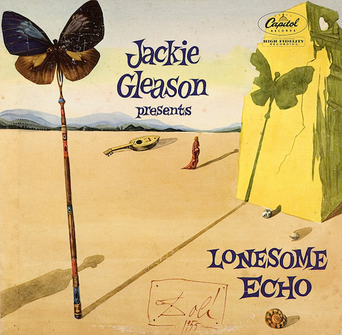
You can see many more fine art album covers by painters like Banksy, Richard Prince, and Fred Tomaselli and photographers like Duane Michaels and Nobuyoshi Araki at Artnet and Flavorwire. The selection of enticing album covers above will hopefully also propel you to revisit, or hear for the first time, some of the finest art-pop of the last four decades. Finally, we leave you with a bizarre and seemingly unlikely collaboration, above, between pop-surrealist Salvador Dalí and Honeymooners comedian Jackie Gleason for Gleason’s 1955 album Lonesome Echo. No weirder, perhaps, than Dalí’s work with Walt Disney, it’s still a rather unexpected look for the comedian, in his role here as a kitschy easy listening composer. Gleason’s many album covers tended toward the Mad Men-esque cheap and tawdry. Here, he gets conceptual. Dalí himself explained the work thus:
The first effect is that of anguish, of space, and of solitude. Secondly, the fragility of the wings of a butterfly, projecting long shadows of late afternoon, reverberates in the landscape like an echo. The feminine element, distant and isolated, forms a perfect triangle with the musical instrument and its other echo, the shell.
Make of that what you will. I’d say it’s the one album on this list with a cover much more interesting by far than the music inside.
via Artnet
Josh Jones is a writer and musician based in Durham, NC. Follow him at @jdmagness